
Design trends may come and go, but few stand out and leave a lasting impression. Glassmorphism is one of those trends that gives a clean, modern look and makes elements look like frosted glass. Thanks to its see-through layers, soft blur, and light shadows, which create a visually appealing interface.
From your favorite app to the latest version of macOS and iOS, you can easily spot this design everywhere. So, how can designers apply Glassmorphism without hurting performance and user experience? Let’s break down the core principles and best practical tips that make it work.
What is Glassmorphism?
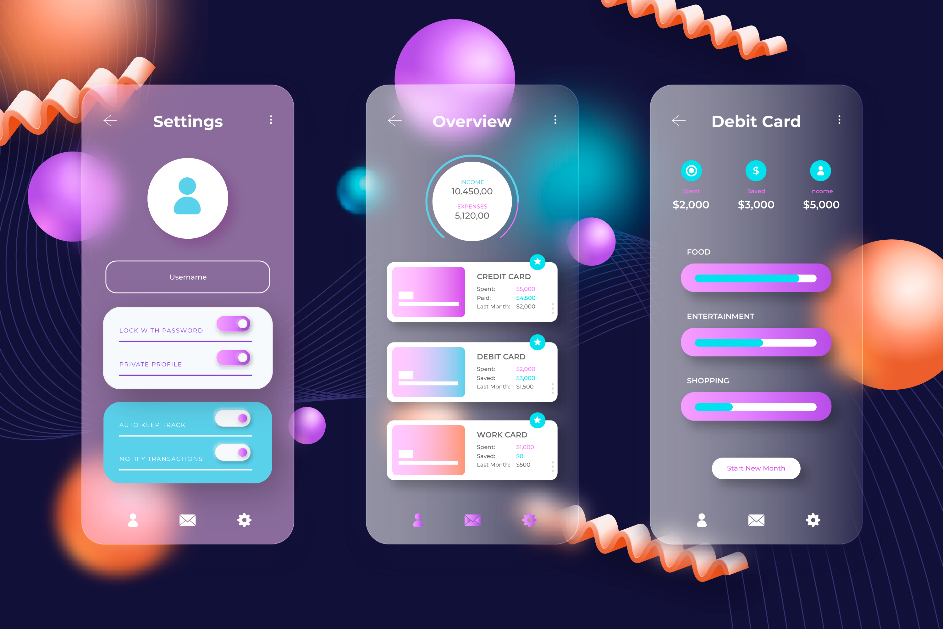
Think of a surface that is translucent, soft, and slightly blurred; that’s the visual charm of Glassmorphism, which is a modern types of UI UX design. It is combined with transparency, frosted blur effects, and fine outlines that bring a smooth and polished look of real glass.
It creates a sense of depth by layering elements, making components float above the background. Unlike Skeuomorphism’s realism or Neumorphism’s depth, Glassmorphism stands to keep things fresh with a clean, glassy look.
Key Principles of Glassmorphism
Glassmorphism brings a modern, sleek vibe to interfaces, which adds clarity, depth, and a touch of style. Here’s a breakdown of its core elements, which clearly define it.
Transparency & Background Blur
Glassmorphism stands out for its transparent layers with a blurred backdrop to achieve a distinct look. This effect lightly blurs what is behind it and keeps the focus on key content. It enhances readability while giving a UI a sense of depth and airiness.
Layering & Hierarchy
Glassmorphism layer with overlapping elements, with blur and soft shadows. It makes it easy to see what’s on top and what’s behind. It helps users quickly recognize what they should click or focus on.
Light Borders
A thin white or light-colored border is used to make sure that translucent elements don’t fade into the background. This border creates a soft boundary around each element, which provides a gentle definition. It helps users to spot the different parts of the UI easily.
Eye-Catching Backgrounds
The Glassmorphism effect stands out best when layered over bold colors or smooth gradients. They boost the blur effect and frosted look, which results in creating a bold, modern visual style.
Smart Ways to Use Glassmorphism
Glassmorphism looks amazing, but it needs to be applied with balance to work well. Here are some practices that help you to know how to use it correctly:
Use Sparingly
Try not to overdo it. It is cool, but too much can make your design look messy and harder to use. It works best on important parts like overlays or content boxes and makes things clear and easy to follow.
Mind the Contrast
A blurry background doesn’t mean your text is easy to read. Make sure your text remains clear by using bold fonts or applying gentle shadows when needed.
Accessibility Matters
Keep in mind that some users have visual impairments. They may struggle with too much transparency or weak contrast. So, while designing, make sure that all users experience your design the same way.
Performance Impact
Blur effects look great but can drain device resources fast. Keep usage minimal to keep things smooth, especially on mobile.
Combine with Other Styles
Glassmorphism works well when paired with a clean, minimal design. It creates a sense of balance between functionality and visual appeal.
Technologies Behind Glassmorphism
If you are thinking about adding Glassmorphism to your next design, start with design tools, which offer intuitive ways to design transparency with blur and create a great glassy look. When you’re ready to build, CSS takes care of the effects by using properties like backdrop filter, RGBA(Red, Green, Blue, Alpha), and a few shadows. Frameworks like Tailwind CSS can streamline the process. If you are looking for inspiration or quick code, try the Glassmorphism Generator or browse Codepen projects.
Final Words
Glassmorphism is a sleek design trend that brings depth and clarity if applied with care. It improves the user experience with a balance of transparency and layering, which keeps things stylish but easy to use. If you want it to work well, then always prioritize its accessibility to everyone.
Whether you are exploring fresh design ideas or need to polish them, then keep the right balance between user experience and visual appeal. If you want to bring your creative ideas to life, then contact a reliable web design company in Dubai. They can help you transform your concept into life.
FAQs
Q1. Is Glassmorphism good for usability?
Yes, it is good if used correctly. It improves visual hierarchy and boosts the design aesthetics. However, too much blur and poor contrast can make content hard to read.
Q2. Should I hire a web designer in Dubai for Glassmorphism?
To enhance your design with Glassmorphism, you must contact the top web design company in Dubai. They provide highly skilled web designers who know the balance of beauty and usability.
Q3. Can I use Glassmorphism on mobile apps?
Yes, Glassmorphism can be used in mobile app design. But be careful with its usage because excessive blur can make readability difficult.
Q4. What is the reason behind the popularity of Glassmorphism?
Most people love Glaamorphism because it gives a cool, glassy vibe, which creates depth and focus in a UI.
Q5. Can everyone use Glassmorphism?
Yes, anyone can use Glassmorphism, but it is important to use it carefully. It is easily applied with modern tools but needs proper contrast, performance, and accessibility.